6 Big Design Elements of a Pharmacy Store that Drive Profits
A survey across a wide range of brick-and-mortar retail shops found that a high number of stores organise themselves similarly. Invariably a customer spends most time directly in front of items which are kept at eye level. The directional flow can be maintained with subtly placed items in broad categories throughout the store without risking sensory overload for the shopper.
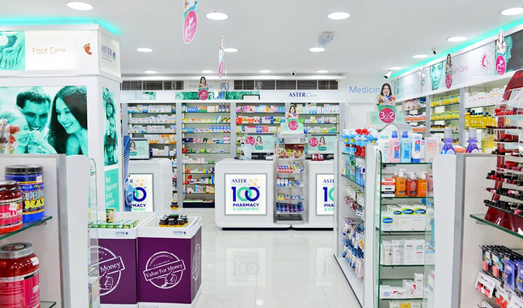
A customer’s habits and patterns form the fundamental way he or she is directed towards the structure of a retail outlet. The structure within a store plays a significant role in driving sales. A supermarket, CDIT, clothing store and pharmacy store have design cues that can guide a customer to make the decision to purchase an item.
Including different features in a store’s layout can create a positive experience for a retail pharmacy customer. Listed below are several key features that have proved to have the most significant impact on the customer’s shopping experience.
High Margin Product Display at the Right Side of the Store Entrance
Most shoppers tend to turn right at the entrance of a retail space before veering counterclockwise through the store. To take advantage of this shopping habit, it’s best to instal a display with high-margin promotional products such as cosmetics and pantry items to the right side of the pharmacy’s front entrance. This will attract and encourage shoppers to view the items on display.
Display Products in the Pharmacy Counter Area which a Customer Wants to Buy
The area next to the prescription counter is a high-traffic zone. The prescription counter tends to receive higher footfall than other areas of the pharmacy store. Inevitably this counter is an excellent place to display over-the-counter items, as it will attract shoppers. The counter’s proximity allows customers to ask questions and employees to make valuable recommendations.
Instal Eye-Catching Displays throughout the Pharmacy Store
High-contrast colours, strategic lighting, and desirable products catch the customer’s eyes so as to direct attention towards the insignificant areas of the pharmacy which are not normally viewed or glanced at.
Retailers that encourage shoppers to linger and browse have seen sales increases of 20-40%. A pharmacy store can create a space with eye-catching displays of in-demand, promotional, seasonal, and impulse purchase products.
Focus on a Clear Display
A retailer might want to highlight all products on offer, but basic store design principles suggest that an easy way to grab the shopper’s attention is to place a specially highlighted product at eye level and surround it with other strategically-placed items.
The Pharmacy Counter Should Be Kept at the Back of the Store
The fundamental principle in designing a pharmacy store layout is to always place the pharmacy counter at the back of the store. This allows shoppers to be guided through the rest of the store, viewing other items, before reaching the pharmacy counter at the end.
Each store has a variety of products on offer for a customer; the more a customer stops to browse items encountered along the aisles, the better the likelihood of products being purchased.
Focus on Ease of Movement, Store Accessibility, and Lighting
A pharmacy tends to get customers of all ages. To be further inclusive, a pharmacy should create wide aisles to accommodate people with movement disability, walkers or wheelchairs. Improving light and appropriate placement of security cameras can help prevent inventory loss and make customers feel safe.
Other key considerations to take into account are:
Seating Comfortable seating will encourage customers to spend more time in the store. This additional time can incline a customer to purchase an item which was previously overlooked.
Checkout Area In stores with an open layout, the checkout area offers additional visual merchandising possibilities. Retailers use it to encourage impulse purchase of complementary merchandise while customers wait to pay. A big pharmacy store can take advantage of this opportunity.
Regularly Update the Visual Elements In a pharmacy, it’s essential to keep the visual elements updated with a focus on promotional offers on products. For example, a special offer on hair-loss products can be highlighted by using posters and banners to adjust the visual elements in the pharmacy store.
The intention of this article is to provide a few ideas for designing an independent and efficient pharmacy store that will provide a high-quality shopping experience. A good design will increase the effectiveness of each section within the store by shifting the focus on necessities with the aim of reducing the time spent by shoppers. Inevitably it will allow the customers to browse products at ease, increasing traffic, conversion ratios, and overall customer satisfaction.
Get a Free Quotation